
The Challenge
SpecFirm had been operating with the same website for over a decade. While the business had grown and evolved significantly during that time, their digital presence hadn’t kept pace. The outdated site no longer reflected the company’s current capabilities, service offerings, or professional standing in the market.
The original website was built before responsive design became standard practice. It simply wasn’t designed to adapt to different screen sizes, meaning mobile and tablet visitors encountered a frustrating experience—pinching to zoom, scrolling sideways, and struggling to tap navigation links sized for a mouse cursor. With mobile traffic now representing the majority of web visits, this wasn’t just an inconvenience. It was costing SpecFirm potential business every day.
Beyond the mobile issues, the aging site had other practical problems. Page load times had become sluggish, and the backend made simple content updates unnecessarily complicated, leaving staff reluctant to make changes even when information became outdated.
Our Approach
We started with a comprehensive discovery process, interviewing key stakeholders to understand how the business had changed over the past ten years. What services had been added? Which had become core revenue drivers? How did the company’s positioning differ from when the original site was built?
This research phase revealed a significant gap between perception and reality. SpecFirm had expanded their service lines, built an impressive client roster, and developed genuine expertise that simply wasn’t visible online. Potential clients visiting the website were getting a ten-year-old first impression.
From there, we developed a modern site architecture that organized content around how prospects actually search for and evaluate services. We restructured the navigation, rewrote core pages to emphasize current strengths, and built in flexibility for future updates. Responsive design was foundational to the rebuild—every element was crafted to look and function properly across devices of all sizes.
The Results
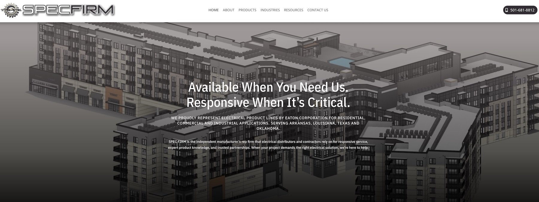
The new SpecFirm website launched with a clean, professional design that accurately represents where the company stands today. Mobile visitors now get the same polished experience as desktop users, with touch-friendly navigation and content that flows naturally on any screen size. Page load times dropped dramatically, improving both user experience and search engine visibility.
More importantly, the site finally tells SpecFirm’s real story. The decade of growth, the expanded capabilities, the track record of successful client work—all of it is now front and center where it belongs.